There has been a paradigm shift in the browsing habit of individuals on the internet due to the advent of high end and smart mobile devices which has prompted businesses to look for quality responsive design. Statistics reveal that by 2015, mobile responsive website will overtake desktop responsive website design in a big way. This has prompted clients to ask for the most professional responsive design for their websites which goes on to support multiple screen size and multiple screen resolutions. It means that your website design would be perfectly compatible to desktops, laptops as well as mobile devices.
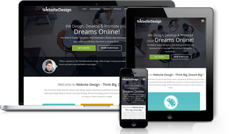
Screen resolution is one of the most vital elements of website design which needs to be kept in mind while designing a highly responsive website. Conventionally, a webpage or a website is built exclusively for a desktop but when the same website is seen on a mobile device, the alignment and resolution seems to alter or differ. This is where a responsive website design comes into play as companies are exclusively looking for such high end responsive design when it comes to designing a professional business portal with all the basic elements and features intact. Responsive design actually refers to a web page which can adjust itself accordingly to different screen size and across multiple devices, be it desktops, laptops, tablets, and smart phones.
Understanding the present psychology of humans in relation to the latest gizmos & gadgets and also regarding web search patterns via the latest mobile devices and thereafter devising the best technology for them is somewhat an intelligent move on the part of any professional Analog Web Services company. Individuals who possess smart gadgets / mobiles and go for surfing the web over it actually looks for the most essential thing that registers most tellingly on their senses. In other words, web page features that that attracts them instantly, such as 'shopping cart' or the actual 'sales pitch'.


When surfing the internet on any mobile device the best part about the website should show prominently so as to provide a customer / user with a clear understanding of the product or service and thereby the actual purchase online. If these things are kept in mind while designing a responsive website design, it is surely going to bring in additional revenue for the company. The crux of the matter is, responsive website design should deliver the most important message about the company to a visitor surfing the web via his / her mobile device.
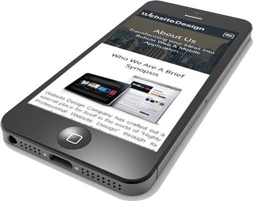
Now coming to the technology aspect about it, we have some of the most proficient and experienced responsive designers who are experts in highly adaptive designs. Our designers and coders have the best of technical skills and expertise in HTML5 and CSS3. Our designers specialize in progressive enhancement wherein when a visitor opens a site on bigger screens such as desktops or laptops, all the basic features are visible whereas when the visitor opens a site on a smaller device such as iPhone or iPad, the website will only display the essential content and the core elements. Our design parameters are very flexible and goes on smoothly to adjust to any screen size. We always strive for improving user experience on a PC, laptop, tablet, smart phone and on every other platform through our dedicated and professional approach.
So, if you are looking for a smart responsive design for your website, you can definitely call us anytime or shoot a mail and we would be more than happy to answer your queries in a most descriptive manner.